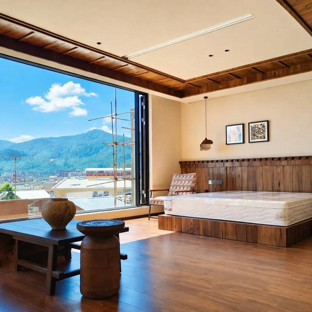
Some hotel art briefs arrive with very little room for interpretation. The interior design is already set. The palette is already locked. The challenge is not to design something beautiful in the abstract — it is to design something that belongs to this specific room, in front of this specific view, against these specific walls.
That was the situation when the design team for a boutique mountain resort in Yunnan came to us. The hotel had 52 guest rooms and a main lobby, all designed around floor-to-ceiling windows facing the surrounding mountain landscape. The interior featured dark-stained wood panelling, textured stone surfaces, and a deliberately grounded, unhurried aesthetic. The brief for the wall art was explicit: nothing light or cheerful, nothing that would read as a generic hotel purchase. The artwork needed to earn its place in the room.
This is a record of how the project was developed — the decisions that were made, the problems that came up, and what we learned from it.
1. The Brief: A Mountain Resort With a Strong Interior Direction
The design studio sent us three things to start: interior renders of a standard guest room and the lobby, a material board showing the primary finishes, and a written direction that included the phrase "the art should look like it came from the mountains, not from a catalogue."
The rooms themselves gave us a clear visual starting point. Dark wood walls, warm stone floors, furniture in muted leather and natural linen. The windows were the visual anchor — large, unobstructed, oriented toward forested ridges and, on clear days, distant snow-capped peaks.
The design team's concern was reasonable: a lot of hotel wall art fails in this kind of environment. Pastel prints look washed out against dark backgrounds. Generic landscape photography looks like a stock image library. Abstract geometric work creates visual noise that competes with the actual landscape outside the window.
What they needed was art that could hold its presence against a dark wall without overpowering the room, and that could coexist with a real mountain view without becoming redundant.
The scope was 52 guest rooms across three room categories, plus the main lobby. Two series were needed: a main series for the feature wall above the bed headboard, and a companion series of smaller works for the side walls. All pieces needed to ship together in a single FOB Xiamen delivery.
2. Choosing the Right Format and Palette
The first decision was format: giclée canvas or handcrafted oil painting?
For this project, handcrafted oil was the clear choice — and not for sentimental reasons. The practical reason is that a large-format oil painting on linen canvas, produced with a palette knife and broad brush strokes, has a physical surface texture that reads differently in a room than a flat printed surface. Against a dark wall, at close range, that texture registers. The painting has presence in a way that a giclée print of equivalent size would not.
This is a context-specific judgement. For rooms where colour consistency across 300 identical pieces matters more than surface texture — a large chain hotel with many floors of standard rooms, for example — giclée is often the better choice. For this project, 52 rooms and a design brief that asked for something with weight and authenticity, handcrafted oil was appropriate. For a detailed comparison of when each format is better suited to hotel rooms, see our format comparison guide.
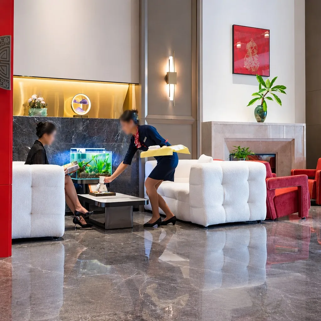
The palette decision followed from the landscape. We asked the design team a simple question: what are the three dominant colours in the view from the rooms on a clear day? The answers were consistent: a particular shade of mountain blue — not bright, slightly grey — the deep green of the pine-covered slopes, and a warm amber that appears in the autumn foliage and in the stone of the mountain faces. Cobalt blue, forest green, and amber-ochre became the palette for both series.
The logic of the two-series structure: the main series for the headboard walls used larger canvases (approximately 80×120cm) with bold, open compositions — a single ridge line, a stand of trees, a sky study. The companion series for the side walls used smaller canvases (approximately 50×70cm) with quieter, more abstracted treatments of the same palette — closer in, more textural, less compositionally resolved. The intention was that a guest in the room would feel the two works belonged to the same visual world, but would not feel they were looking at the same painting twice.
3. Production: Matching Palette Across Two Series
The first step was a sample set: three pieces from the main series and two from the companion series. The sample round takes 7–12 working days and is non-negotiable for handcrafted work — there is no reliable way to approve oil painting production remotely without seeing physical pieces.
The client's feedback on the first sample round was useful: the cobalt was reading too bright in the photographs, and they wanted it to feel more atmospheric — closer to the colour of mountain haze than clear sky. The painters adjusted by mixing in more grey tone and slightly desaturating the blue. The second sample set landed correctly.
From approved samples, full production for the two series followed. Each piece was produced by the same team of painters who had done the samples, which matters for consistency. Different painters interpret the same palette differently — keeping the same hands on the same project throughout production reduces variation.
For handcrafted oil paintings, we do not apply Delta-E colour measurement — that standard applies to giclée production, where the goal is precise digital reproduction. For handcrafted work, the standard is different: pieces should belong to the same family and feel coherent when seen together, while tolerating the natural variation that is inherent to the medium. We achieve this through reference pieces (the approved samples, which stay in the studio throughout production as a visual guide) and colour proportion guidelines (the approximate ratio of each of the three palette colours in each piece type).
Every finished piece was photographed in controlled studio lighting before packing. The full image set — every canvas from both series — was shared with the client's design team for pre-shipment review. Two pieces from the companion series were flagged and repainted before the shipment was released.
For the full mechanics of Delta-E specification and remote batch verification at 500+ room scale, see our colour consistency guide.
4. Delivery: Packed by Floor
Packaging for a hotel project requires more planning than standard export packing.
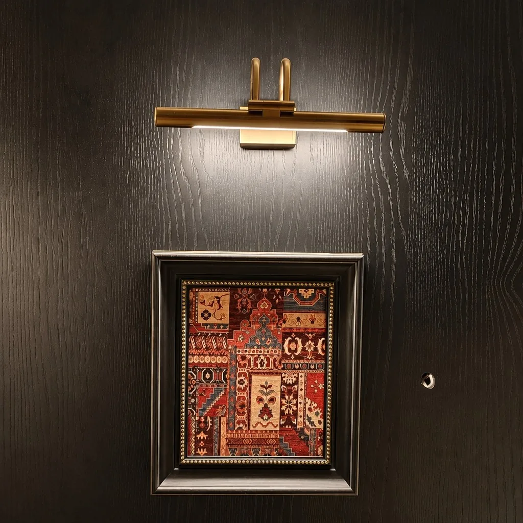
Pieces were packed by room category and labelled with floor number and room number. This means the installation team on-site can take a pallet, cut the tape, and pull the pieces for their current floor without sorting through a mixed shipment. On a 52-room project, the time saved during installation is meaningful.
Large canvases from the main series (80×120cm and above) were individually wrapped in polyethylene foam, cornered with moulded foam protectors, and packed in double-wall corrugated export cartons — two or three pieces per carton depending on size. The smaller companion series pieces were packed four per carton with foam interleaving.
The delivery was FOB Xiamen, with freight arranged by the client's logistics team. The shipment cleared Chinese export customs without complications; the framing materials for this project were solid wood rather than composite, which simplified the documentation.
5. What Made This Project Work
Looking back at this project, three things stand out as genuinely useful for anyone planning a similar commission.
Start with the room, not the art. The design team for this project had already defined the room before the art brief was written. The dark walls, the mountain view, the grounded material palette — all of these were fixed. The art had to respond to what was already there. When we extracted the palette from the landscape and the interior simultaneously, the result was coherent. Hotel art that is chosen independently of the room design tends to look like what it is: a separate purchase.
Series design matters more than individual pieces. Fifty-two rooms with 52 unrelated paintings would have felt like a flea market. Two series with a shared palette and complementary scales felt like a design decision. The investment in defining the two-series structure upfront — agreeing on the size relationship, the compositional contrast, the palette ratio — paid back throughout the project in fewer decisions and less confusion during production and installation.
The sample round is where projects succeed or fail. The colour adjustment we made between the first and second sample set — desaturating the cobalt — sounds minor. But if we had gone to full production with the first samples, 52 rooms would have had walls with slightly-too-bright blue canvases that would have clashed with the atmospheric quality the design team was building toward. The cost of two sample rounds is 7–24 working days and a fraction of the production budget. The cost of a large-scale repaint is everything.
FAQ — Hotel Art Project Planning
Q: How do you match wall art to an existing interior design direction?
A: We ask for interior renders, material boards, and colour references before recommending any palette. For this Yunnan project, we started by extracting the three dominant tones from the existing interior and the mountain view outside — cobalt blue, forest green, amber-ochre — and built the palette from there. The art should read as part of the room's visual story. We do not recommend palettes without seeing the room first.
Q: How many sample pieces do you produce before bulk production begins?
A: Typically 3–5 pieces in final size and finish. For projects involving handcrafted oil paintings, we recommend a sample set that covers at least one piece from each series — so the client can verify both the palette and the tonal relationship between them. Sample lead time is 7–12 working days.
Q: Can you produce two series of artworks in the same shipment?
A: Yes. Multi-series orders ship together FOB Xiamen. Pieces are packed and labelled by room category so the installation team can work directly from the delivery without sorting. There is no additional logistics cost for combining series in one shipment.
Q: How do you ensure consistency in handcrafted oil paintings across 50+ rooms?
A: We use reference pieces (the approved samples, kept in the studio throughout production) and colour proportion guidelines rather than Delta-E targets — which apply to giclée, not to handcrafted work. Each piece is photographed in controlled lighting before packing, and the full image set is shared with the client for pre-shipment review. Pieces that fall outside the agreed colour range are repainted before dispatch.
Q: What is the total lead time for a 50-room hotel project?
A: For a mixed project with two handcrafted oil series, the total lead time is typically 35–45 working days from approved samples to FOB Xiamen. Add sea freight time based on destination: approximately 15–20 days to US West Coast, 20–25 days to US East Coast.
Q: Do you work directly with interior designers or only with hotel procurement teams?
A: Both. For this project we worked directly with the interior design studio on art direction and production, and coordinated separately with the hotel's procurement team on payment and logistics. We are comfortable working at either level, or both simultaneously on larger projects.
Discuss Your Hotel Art Project
If you are working on a hotel or resort art programme with a specific interior direction and want to talk through format, palette, or the sample-production process, we are happy to review a project brief.
Contact: sales@qitong-arts.com
Response time: within one business day
Trade Assurance: available on Alibaba for all orders